Behind the scenes with publishing: the evolution of a book cover
Have you ever wondered how book covers are designed?
Do the authors have the final say? How many versions do people do? What’s the process? And what did your favorite covers look like before they were revealed?
Good news: today that’s exactly what we’re going to talk about. I’m going to take you through every step of the process of developing the cover for The Wicked Unseen, my YA Satanic Panic book (out soon!).
First, one quick caveat: this is my personal experience and may not reflect every publisher or title. Some contracts give authors more control over the cover than others. I’m fortunate in that my contracts have given me a substantive role (which I very much wanted).
Ok, now into the process…
Step one: the brief
Before design began, my editor wrote to ask me to send them ideas, character descriptions, themes, covers I particularly loved, etc. Since I’m extra and since I’ve worked in marketing/content for a long time, I went a bit above and beyond, providing a six-page cover brief with the book description, a link to a Pinterest board full of book covers I love, two cover concepts, descriptions of characters, mood, and setting, themes, who my readers are, and concepts I don’t think would work or would personally hate.
Below is the exact wording from concept #1 in the brief (spoiler alert, this is pretty similar to what we ended up with!):
A dark/twilight forest with a hint of blonde hair and yellow sweater dress disappearing into it/being swallowed up. Perhaps with a graveyard in the foreground if that doesn’t feel too busy.
Step two: finding a designer
Next up, my editor reached out with a handful of design portfolios from cover artists she thought might be a fit. Nearly every single one was a wow for me and ultimately we landed on working with Kid Ethic. Spoiler alert: I loved working with him and highly recommend him.
Step three: concepts, part I
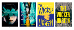
So, here’s a fun fact: I wasn’t actually involved in the earliest round of design. It wasn’t until recently that I saw these very early concepts. My team at Underlined took the reins and did a phenomenal job of honing concepts for a round two before bringing me in.
That first round of concepts that I didn’t see looked like this:

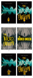
As we get into the next round, you’ll notice the main shift they made was to move away from faces and toward a focus on the forest elements of the cover.
Step four: concepts, part II
Now this is when I was brought back into the loop. They’d honed in on two primary background concepts and a handful of variations on each one. They all had less faces and more creepy forest vibes. And I finally got my “girl disappearing into forest” from the original concept.

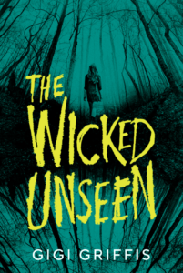
For me, number three was a clear winner in terms of direction, but I worried that the washed out background wouldn’t pop on a bookshelf or display. With the help of a designer friend, I sent back my own variation on that concept.What if we kept the background and the title font, but stole the green from the other concept and made her dress yellow? I did a rough mock-up with the help of my friend (and just mentioned the yellow sweater dress).
This is what I sent back to my editor:

Step five: here comes the final!
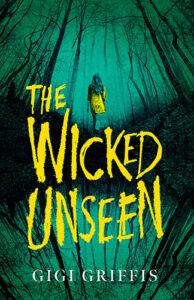
The designer took that direction and knocked it out of the park. We kept our background and our font but turned up the volume on the colors and made them a bit creepier. And here’s where we landed…a perfect take on my original creepy forest concept:

That’s all she wrote! And if The Wicked Unseen sounds up your alley, you can order now!

Leave a Reply